Component Library - New UI
 Security and navigation
SECURITY Refer to COMPONENTS > Components in Security Level Details - Permissions
NAVIGATION New UI > Automation > Components
About
The Component Library displays a list of all components that you have downloaded from the ComStore or created yourself. If the ! icon appears next to this section, it means there are updates available for your components. Refer to Update needed.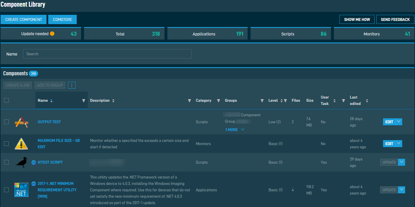
Creating a component
You can create a new component by clicking the Create Component action button displayed at the top of the page. Refer to Creating a component - New UI. This button is only displayed for users that have Manage permission for COMPONENTS > Components. Refer to Security Level Details - Permissions.
ComStore
You can navigate to the ComStore by clicking the ComStore action button displayed at the top of the page. Refer to ComStore - New UI.
Component categories
At the top of the page, components are sorted into categories. The categories are as follows:
| Category | Description |
|---|---|
| Update needed | All components with updates available. Only displayed for users that have Manage permission for COMPONENTS > Components. Refer to Security Level Details - Permissions. |
| Total | Displays the total number of components. |
| Applications | Refer to Applications. |
| Scripts | Refer to Scripts. |
| Monitors | Refer to Monitors. |
You can also create component groups and associate components with them based on your own criteria. This is helpful if you have components that are frequently viewed or edited. Refer to Add to Group.
Component search
Enter a component to search for (search results are narrowed as you type), then select the name from the list. Search results depend on your component level. Refer to Component Level.
Action buttons
The selection box allows you to select one or more components. Select all components shown by checking the selection box in the table header. Once you have made your selections, choose from the following options. To access all options, click the Row Actions icon at the end of the row.
| Action Button | Description |
|---|---|
| Create a Job | Select components from the list and then click Create a Job. This action is only available for the categories Applications and Scripts. The new job will be populated with the selected components. Refer to Creating a job. |
| Add to Group | Select one or more components and click Add to Group. In the dialog box that appears, select an existing group to add the components to, or add them to a new group. If you are adding components to a new group, enter a name for the group and click Add.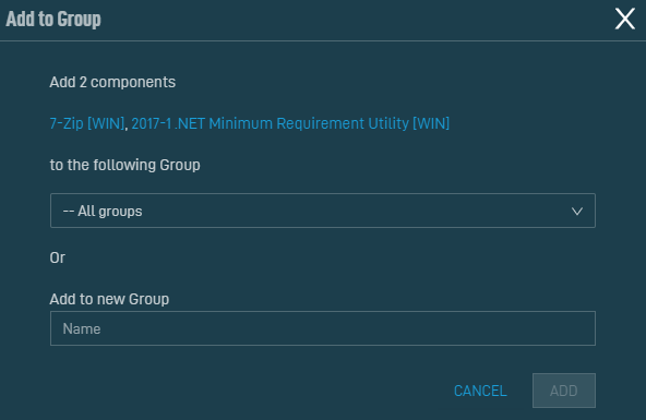 NOTE This action is only available for the categories Applications and Scripts. An error message will display if a monitor component type is selected. |
| Update All | To update all components at once, select the check box in the table header and select Update All.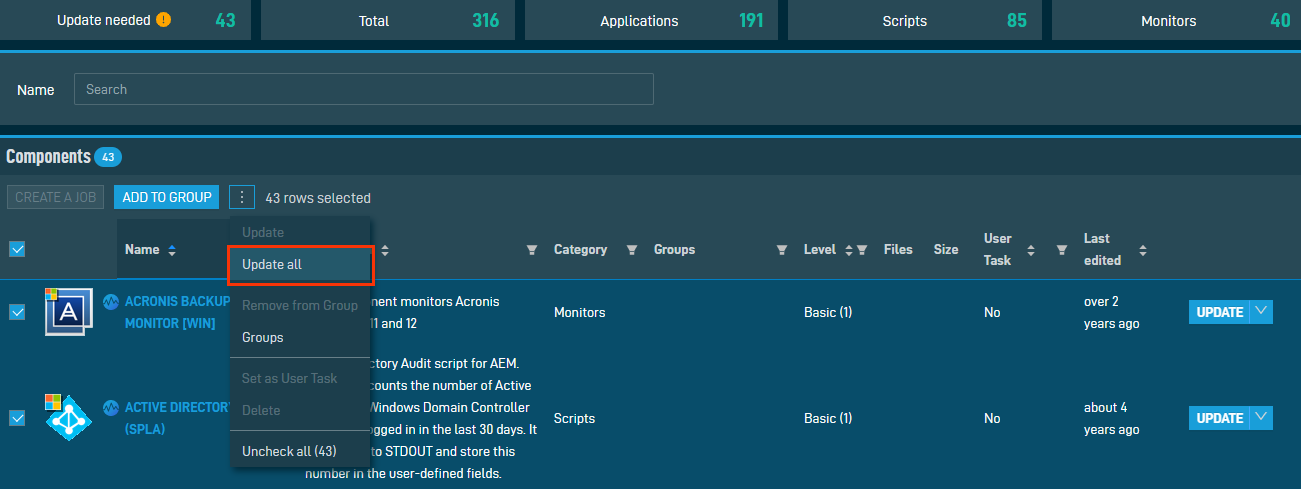 Alternatively, select multiple components from the list and select Update All to update the selected components. |
| Remove from Group | Only one component can be removed from a group at a time. In the dialog box that appears, select the group from the drop-down list and click Remove.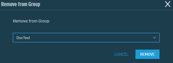 NOTE This action is only available for the categories Applications and Scripts. An error message will display if a monitor component type is selected. |
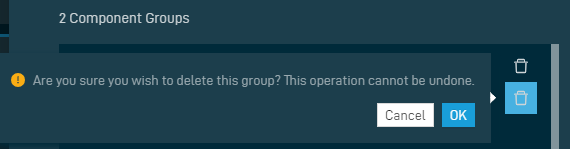
| Groups | Select to view a list of all Component Groups in alphabetical order. 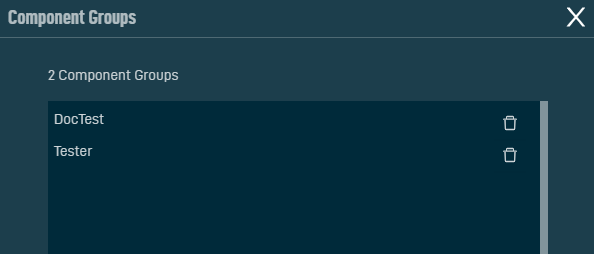 Delete groups from the list by clicking the Delete icon next to the group. Observe the warning dialog box that appears and click OK. |
| Set/Unset as User Task | Sets the component as available or unavailable to all end users with the Agent installed on their computer. You can only perform this action on one component at a time. NOTE This action is only available for the categories Applications and Scripts. An error message will display if a monitor component type is selected. |
| Delete | Deletes the component. Only one component can be deleted at a time. Refer to Editing a component. |
| Uncheck All | Deselects all selected rows. The number of selected rows is indicated in parentheses and next to the Row Actions icon. |
| View | Row action only. Click to view the component's details page (read-only). Refer to Viewing component details. |
| Update | Row action only. Click to update the component. Hovering over the button will display the release notes for the component update. If no update for this component is available, the button will appear as grayed out.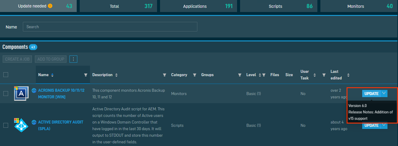 |
| Edit | Row action only. Click to edit the component's details. Refer to Editing a component. |
 The components table
At the bottom of the page, the components table displays the following columns:
| Field | Sortable? | Description |
|---|---|---|
| Name |

|
The name of the component. To narrow the list, click the Filter Menu icon, enter a term, and click Search. To see the full list, click Reset. The search results are narrowed as you type. |
| Description |
|
The description of the component. To narrow the list, click the Filter Menu icon, enter a term, and click Search. To see the full list, click Reset. |
| Category | The category type of the component. Click the Filter Menu icon and click Applications, Monitors, or Scripts to filter by the type of component. You can filter by multiple categories. | |
| Groups | The groups this component is contained in. To narrow the list, click the Filter Menu icon, enter a term, and click Search. To see the full list, click Reset. | |
| Level |

|
The component level of the component. Click the Filter Menu icon and click Basic (1), Low (2), Medium (3), High (4), or Super (5) to filter by the component level. You can filter by multiple component levels. |
| Files | The number of files associated with this component. | |
| Size | The size of this component. | |
| User Task |
|
Displays whether or not this component has been set as a user task. Click the Filter Menu icon and click All, or Yes, or No to filter by user task status. |
| Last Edited |
|
The date the component was last updated. |
The number of results displayed can be specified by selecting the desired number from the drop-down menu at the bottom of the table. This selection will persist the next time the page is accessed.
Individual component actions
Various actions can be performed on an individual component at the end of the component's row in the table. Hover over the V icon next to the button to access all available actions. The type of component determines which actions are available. Refer to Action buttons.


